Google Map App
Fake Project
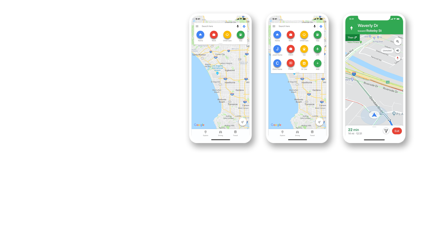
This project focuses on in-car usage of Google Map and proposes a user centric approach to improve the functionality of the app. Through the research and iterative design, we have found a way to save time for the user and reduce friction in the usage of the app.
How to make Google Map App more “drive-able“?
Google Map is the global leader in mobile navigation app market. It has transformed the way we get from point A to point B and yet, in spite of its many benefits, there are many ways to improve and make it more useful for people.
- Overview of the process
- Research
- Design
- Recommendations
- Conclusion
User-Centric Design Process
Our research and design process is based on Double Diamond framework.

I. Discover
One on One Research is used to avoid familiarity bias and also get rich insights based on reliable responses.
II. Define
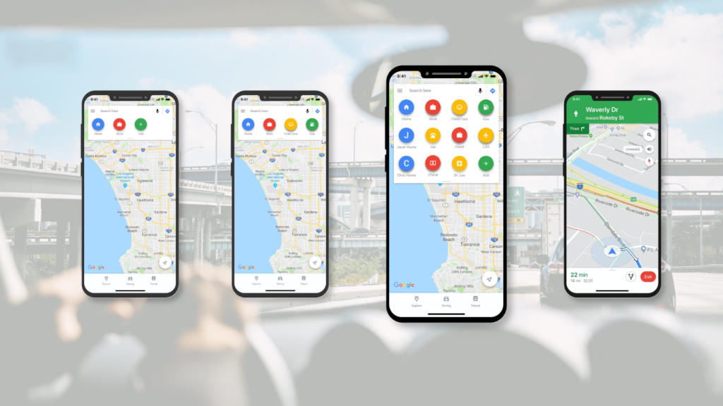
We found that the major problem was the functioning shortcut. The existing shortcut is somewhat hidden and too small to be functional. This leads to users have to navigate multiple steps to get to the navigation page, thus wasting a lot of time to get to the wanted destination which are frequent and used almost on daily bases.
Design Requirements
- Reduce number of steps needed to get to the navigation page
- Make the shortcuts more visible and intuitive to use.
- Design change should conform with existing design framework.
- Design change should require minimum learning curve.
III. Develop
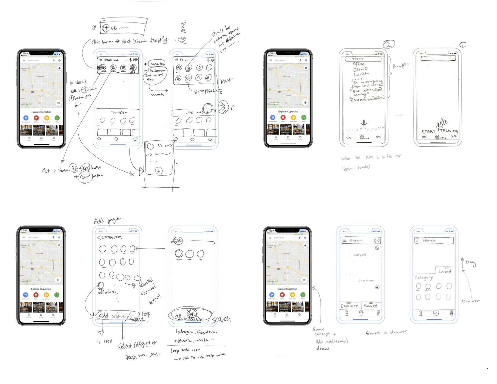
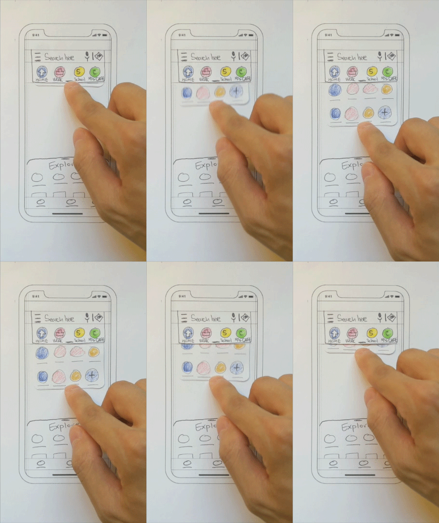
1. prototyping – Low Fidelity
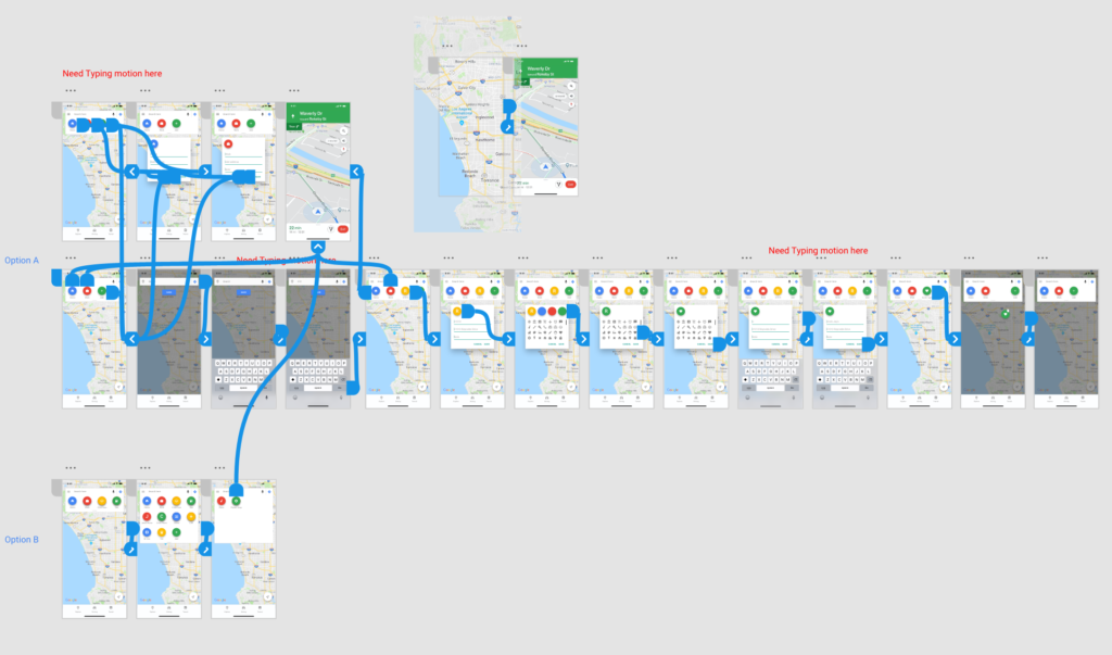
2. prototyping – High Fidelity
Adobe XD is used to make Hi-Fidelity Prototype
IV. Deliver
After a few iteration and design changes, the project is finalized. The shortcut saved the time needed to get to navigation page by 80% on average. The design of the tray does fit well within current aesthetic of the app and design concept.
V. Take Away
It is so much easier to work with solid design framework (in this case, Google’s Material), but you are also some what limited in that framework. It is a challenge worth awhile to work with in a framework but be innovative at the same time and it is something I’d like to take on more often to push my self.

After the completion of the project, I noticed that the updated Google Map(5.38) features very similar shortcut.